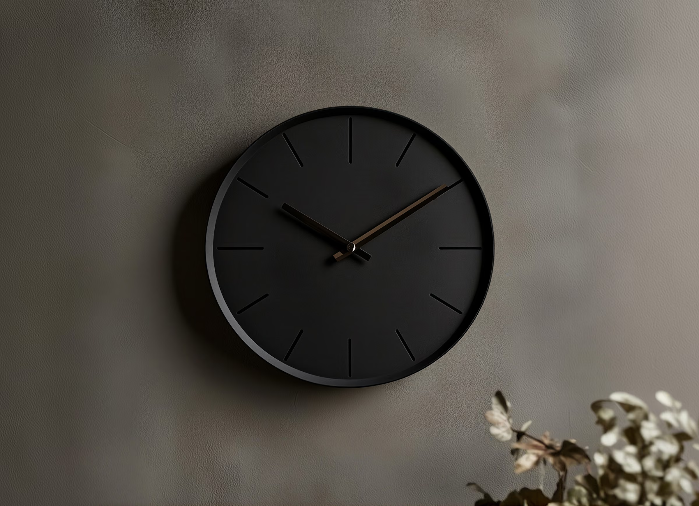
The power of minimalism in modern design

Less clutter, More clarity
Minimalism helps designers focus attention on what matters most. By removing unnecessary decoration and simplifying visual elements, a design can communicate its message with greater clarity.
Whitespace, considered typography, and restrained color palettes create room for content to breathe. Rather than making a design feel empty, these choices can give it structure, balance, and a more confident visual presence.
Every detail has a purpose
Successful minimalism requires discipline. When a design contains fewer elements, each one carries more responsibility. A headline, image, or button must contribute to the overall experience rather than simply fill space.
The goal is not to follow a strict aesthetic formula. It is to understand the audience, define the message, and use only the elements that help communicate it effectively.

Principles of minimalist design
- Prioritize hierarchy: Make the most important information stand out.
- Use whitespace intentionally: Create separation and improve readability.
- Limit visual distractions: Remove elements that do not serve a purpose.
- Choose typography carefully: Use type to establish tone and structure.
- Keep layouts consistent: Create a cohesive experience across pages.
“Minimalism isn't about having less. It's about making every detail count.”
Find the right balance
Minimalism should never come at the expense of personality or usability. A thoughtful illustration, expressive typeface, or unexpected accent color can add character without overwhelming the composition.
Start by identifying the core message, then build a visual system around it. When every choice has a reason, simplicity becomes a powerful design tool.